Graphical forms of data charts: Dataset 2!
Brain region specific gene expression
Methamphetamine (METH) is a stimulant amphetamine drug that is extremely addictive. Alot of people are treated for METH use disorder relapse. This study by Miao et al., 2023 looks at the epigenetic and transcriptomic changes induced in a few rat brain regions and they find a strong molecular response of the neurotoxic METH in all the regions, although different regions respond differently. The study also supports previous research indicating complicated epigenetic remodeling events at different levels induced by METH exposure, rather than differentially expressed genes correlating directly to chromatic accessibility changes on the promoter region.
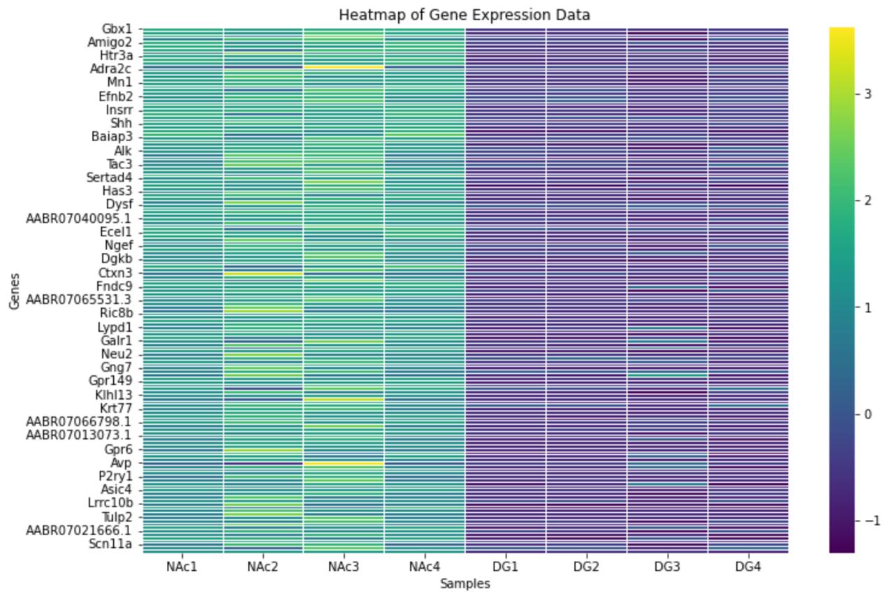
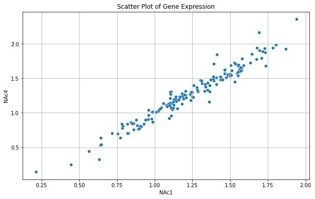
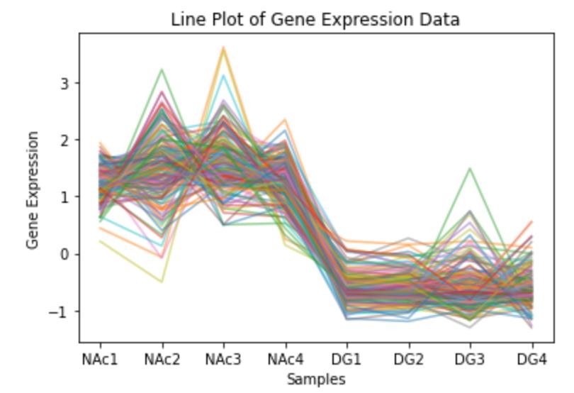
We used the gene expression dataset to plot a heatmap, scatterplot and lineplot. To be able to make it concise for this practice we shortened the original dataset to keep only about 155 genes.
The Gene Expression dataset represents the region specific expressed genes at transcriptomic levels for NAc and DG. The dataset contains:
- Name of each gene
- Brain region NAc (x4 rats)
- Brain region DG (x4 rats)
| GeneName | NAc1 | NAc2 | NAc3 | NAc4 | DG1 | DG2 | DG3 | DG4 |
|---|---|---|---|---|---|---|---|---|
| Gbx1 | 1.7338377 | 1.515618 | 1.733414 | 1.6800561 | -0.5474918 | -0.5477760 | -0.615592324 | -0.5477029 |
| Synpr | 1.5120825 | 1.161486 | 2.081961 | 1.6144812 | -0.6777850 | -0.6764080 | -1.170525639 | -0.4987112 |
| Ngfr | 1.5319227 | 1.005814 | 2.419328 | 1.4476510 | -0.4325831 | -0.4332981 | -0.463815989 | -0.4434805 |
Now, let’s visualize the data!
Open one of the binders containing the R or Python Notebooks to generate the following plots:
Heatmap
A heatmap is a data visualization tool that uses color to represent values in a matrix. It is used to display the magnitude of values in a two-dimensional space, making it easier to understand complex data. Here it provides a clear and immediate visual summary of the levels of genes expressed, in this case through a z-score for every gene shown in the respective brain region. The color bar on the side gives a key to analyze the level of gene expression.

Scatter plot
A scatter plot displays values for typically two variables for a set of data. The values are represented by dots, where each dot’s position on the horizontal (x) and vertical (y) axis represents the values of the two variables. Scatterplots are particularly useful for identifying relationships, patterns, and correlations between variables providing a clear and intuitive way to visualize and interpret relationships between the two variables.
Patterns such as clusters, trends, and outliers can be identified in these plots. Correlation analysis, understanding distributions, identifying outliers and comparing different groups are some common uses of visualizing data on a scatter plots

Line plot
A line plot, also known as a line graph displays information as a series of data points connected by straight line segments. It is commonly used to show trends to compare different sets of data.
- X-axis (Horizontal Axis): Typically represents the independent variable (e.g., time, categories).
- Y-axis (Vertical Axis): Represents the dependent variable (e.g., measurements, values). Each data point represents a value at a given position on the x-axis while the lines connect consecutive data points, making it easy to observe trends, patterns, or changes in the data.
Line plots are commonly used for trend analysis; showing how data changes over time, comparing multiple datasets or monitoring changes etc. Here transcriptomic comparisons are shown over different samples and whether or not any variation is observed in a sample.

Refer to “Salience” in Data Visualization handbook.
- Do you think such line plot is an ideal visualization of our data?
- What changes would you suggest to improve the Silence of this graph?