Graphical Forms of Data Charts: Dataset 1
Filter and Fire
Cortical neurons have long been observed to form multiple synaptic contacts with it’s post-synaptic target. Yet, the functional advantages that arise with this increased number of contacts is still to be understood.
In this study, the authors propose a ‘Filter and Fire Neuron Model’ (F&F), which, in contrast to the long-stablished ‘Integrate and Fire Neuron Model’ (I&F), takes into account the spatio-temporal information obtained from multiple synaptic contacts.
To compare the efficacy of the different models, they tested the ‘memory capacity’ of the neurons by training the neurons in each model type to emit precisely-timed output spikes for a random input pattern, in this case, handwritten digits:
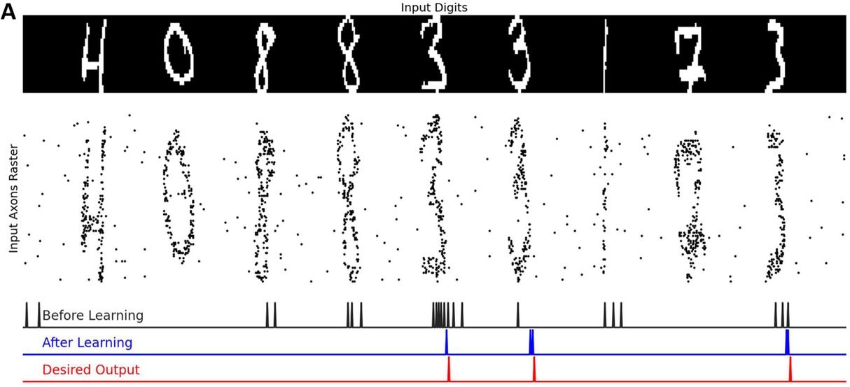
The Filter and Fire Dataset table contains the following information:
- digit: handwritten digit used as imput pattern for training the neurons
- M_connections: number of connections per neuron
- Time: temporal interval
- Accuracy.baseline: Baseline accuracy of a neuron to detect a digit (before training)
- Accuracy.FF: accuracy of produced spikes after training under the Filter and Fire model
| digit | M_connections | Time | Accuracy.baseline | Accuracy.FF |
|---|---|---|---|---|
| 7 | 5 | 60 | 94.44000 | 89.72 |
| 3 | 5 | 60 | 94.71000 | 90.42 |
| 1 | 5 | 30 | 89.93667 | 89.90 |
Now we can go on an visualize our data!
Open one of the binders containing the R or Python Notebooks to generate the following plots:
Barplot
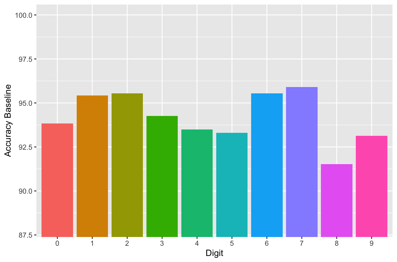
We can observe the Baseline Accuracy displayed by neurons for the detection of each handwritten digit by making a Barplot.
Barplots are usefull for representing relationships between a numeric variable (in this case, the Baseline accuracy values) and a categorical variable (in this case, the handwritten digit pattern).
As mentioned on section “Color Theory in Graphs” of the Data Visualization handbook, color is an important element to aid with visualizing our data. Here, we have selected to use a different color for each one of the digits so we can easily visualize the differences between them.
Boxplot
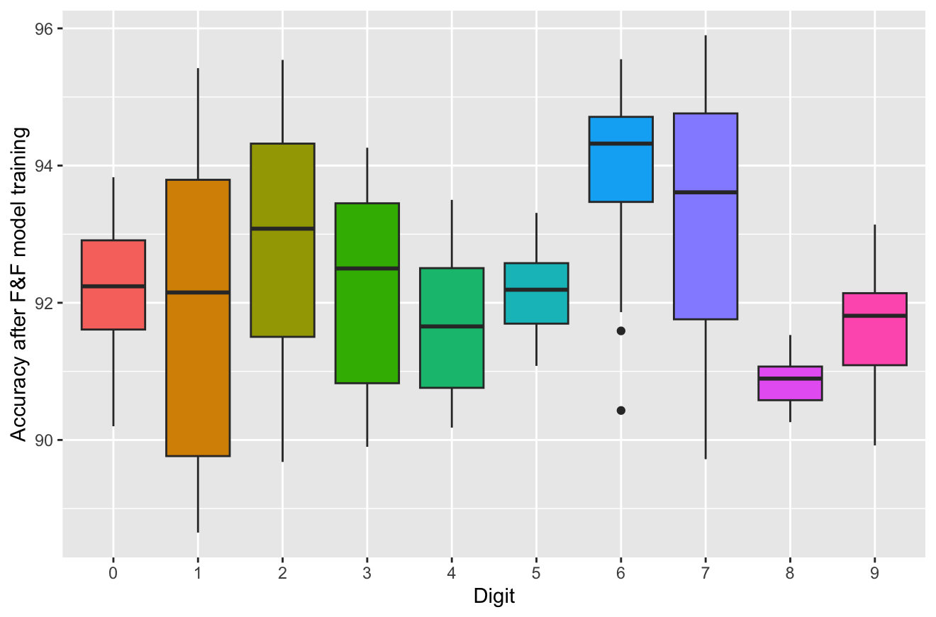
Now, we can generate a Boxplot to visualize the distribution of the Accuracy values obtained after training with the F&F model.
Boxplots allow us to observe the distribution of numerical data according to their descriptive statistics. It displays the minimal value, the first quartile, the median, the third quartile and the maximum value. It can also help us see if our data follows a normal distribution or if it is positively or negatively skewed, depending on the location of the median inside the box. Moreover, when a value is more extream than the expected variation, it displays it as outlier points.
- By looking at the following graph, which digit’s F&F model Accuracy seems to follow a normal distribution?
- Which one clearly shows outlier values?
Violin plot
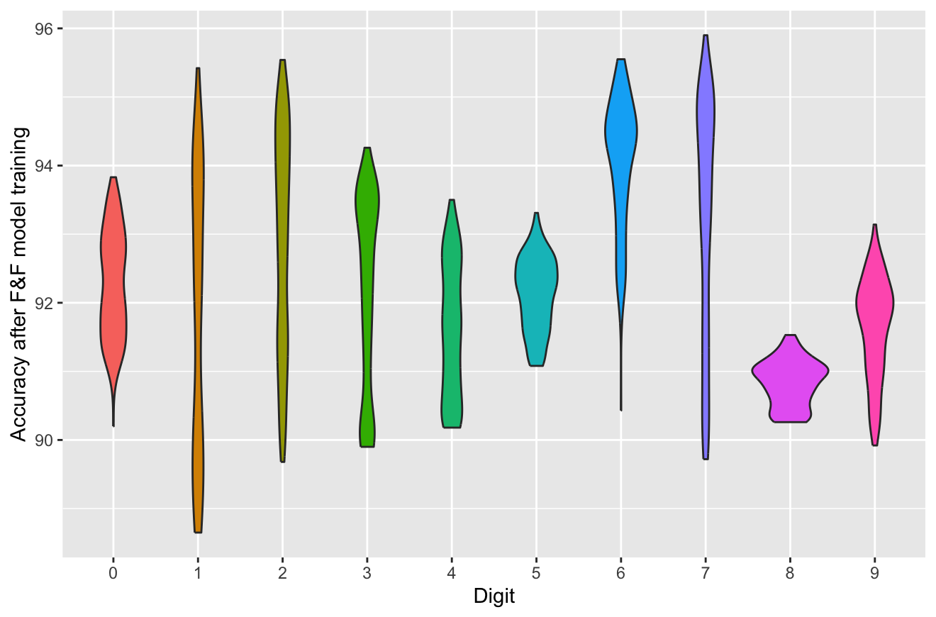
Another graph that allows us to observe the distribution of the F&F accuracy values is the Violin plot.
Violin plots use density curves to plot the distribution of numerical data. Here, the width of each curve represents the density of data points on each region. It can be combined with other plot types such as scatterplots or boxplots to provide extra information.
Histogram
A Histogram is yet another plot type that is used to visualize the distribution of continuous numerical values as bars. Usually, each bar represents the frequency of data points that have that particular value.
Histograms are useful for visualizing the distriburion of a single variable. In this case, we have selected the digit 9 to observe the distribution of it’s F&F accuracy values.
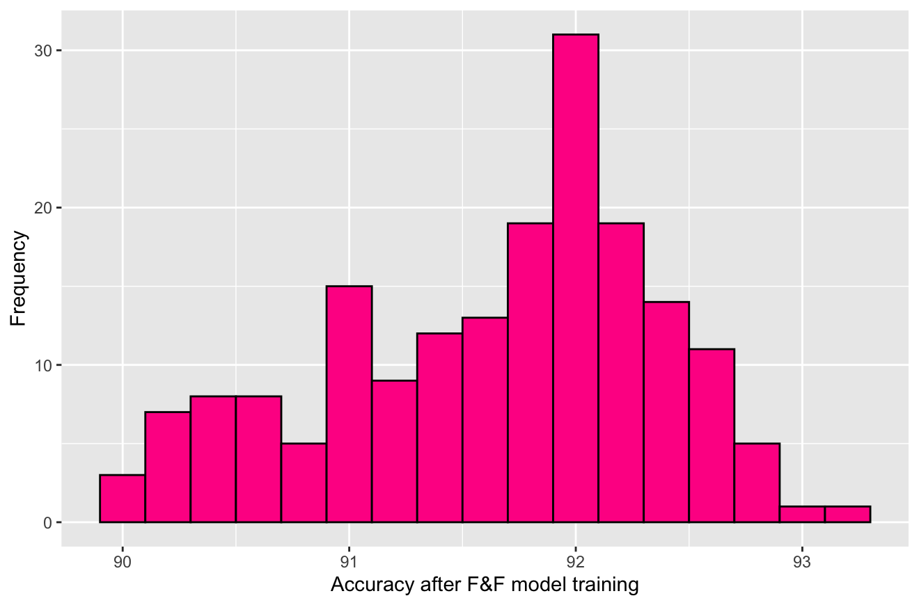
In this case, plotting the F&F accuracy values of a particular digit might not be very informative. This is a great example of how important it is to choose the plot that best help visualize and interpret our data.
Whenever in doubt, remember to ask yourself the following questions (as extracted from the Data Visualization Handbook Checklist):
- Does the graphical form correspond appropriately to dataset-specific parameters such as number and nature of the variables?
- Does the graphical form illustrate the desired relationship among the data?